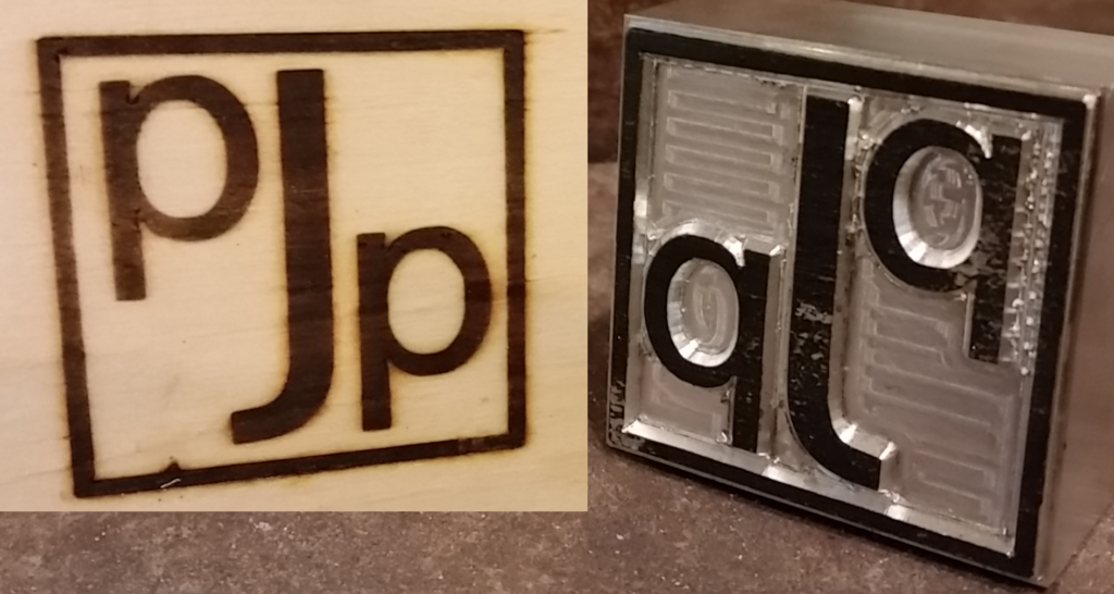
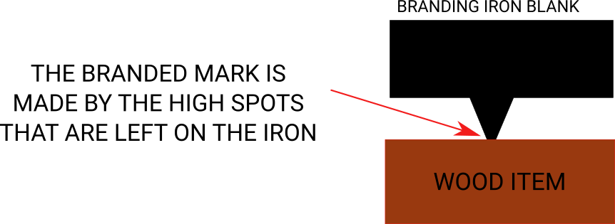
If you look at one of the branding irons I make, you’ll see that the part that does the branding is raised and the parts that are unbranded are cut back from it.
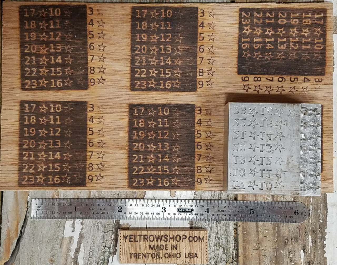
I have done experiments to determine what works and what doesn’t. The below image is a test burn I made with my “torture test” iron. It is designed to figure out exactly how where something becomes so small it won’t work anymore.
To make an iron, I have various sizes of cutter that plunge into the metal and cut it away. When I make something like the J in the photo, the profile of it looks like shown below:
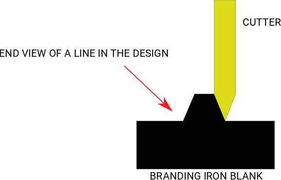
Lines in my designs can only be so thin before there isn’t enough metal left to heat the wood. This absolute minimum line thickness is 0.006” If you take the number of pixels across your image (say 800) and divide by the number of inches the iron is wide (say 2) you can get the pixels per inch. For this example 800 pixels/2 inches = 400 pixels per inch, or 400 dots per inch (dpi). You can determine how big a line is by zooming in and counting the pixels and dividing by the pixels per inch. Example 12 pixels wide/400 pixels/inch = 0.030” I often set a brush to the size of my minimum line thickness and hover it over my image to gauge if a line meets this minimum requirement. The same “hovering” can be done with the gaps in the drawing, although those need to be bigger. Below is an image illustrating how the tiny cutter is pulled up and can cut an narrower groove.
Gaps and White Spaces in the Design
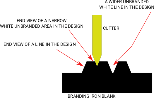
To make a narrow gap (white line) in a design, the cutter has to be pulled back to use just the very tip of it. Gaps in my designs can only be so narrow before the gap is so shallow and narrow that the wood in the little gap gets baked by all the hot metal around it. 0.023” is about the minimum size gap that can be guaranteed to exist in the metal and have a chance of not getting blackened. 0.012” is the smallest gap that can be made at all. Gasps that small often fill in during branding. Sometimes that’s fine. Two letter O’s merging together where they get close are perfectly legible. Two long parallel lines that merge into one aren’t usually okay.